So to speak.
In the latest issue of The New Yorker, Emma Allen writes about ”the First Lady's red inaugural gown. Or was it more of a "ruby," as Jason Wu, its designer, described it? Or "persimmon," as The Times suggested? The Daily News offered "crimson," the Boston Globe "scarlet," and, as the President settled back into the Oval Office, the dispute raged on."
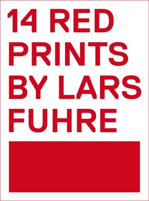
My 14 red posters are printed with Rouge Chaud 426 (Warm Red, Joop Stoop Litho Ink).
I don't know what the equivalent PMS would be. I always liked 485.
Sorting your books by colors is a popular way of showing that you don't really care what they're about.
Flipping through my library of photos from the past few years I feel I want to do the same with images. I don't care what they are showing, as long as they are color coordinated with red hues on them, be it ruby, persimmon, crimson, scarlet, or just plain red.


No comments:
Post a Comment